My role
UX/UI Design
My role
UX/UI Design
Project type
Case study
Year
2017
“Clarity” is a design concept for a cross-platform infotainment system. The system is composed of two modules:
Most vehicle infotainment systems are composed of different components that have different design languages and behave completely different.
Clarity is designed as a whole. The user does not need to learn two different user interfaces in order to control the exact same thing: his/her car.
Learn it once, use it everywhere. The interface is adapted to each platform, yet it is similar.
The whole system is designed with simplicity in mind. Nothing is more than two taps away. This is especially important for in-car infotainment systems as the user needs to pay attention to the road ahead.
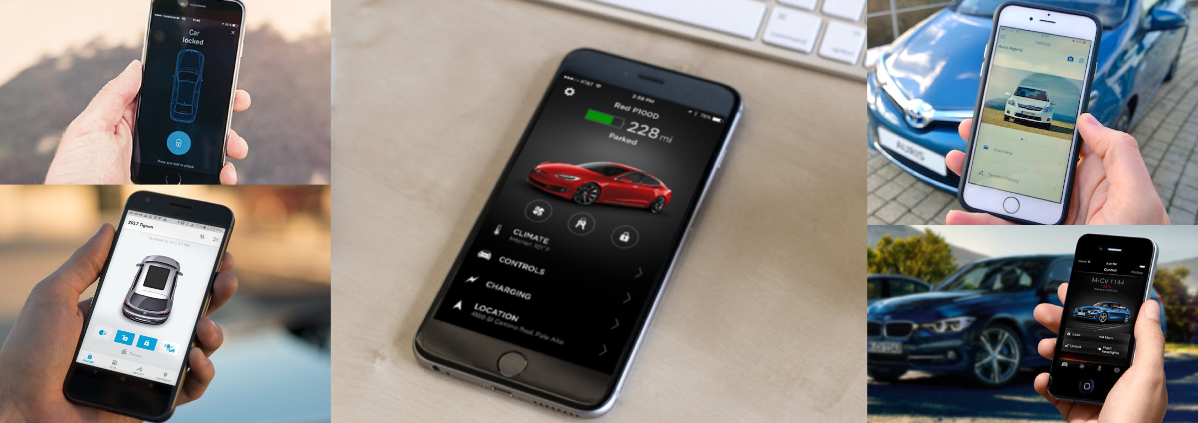
The first step of the project should always include a competitive analysis.
During this step all the alternative existing solutions are explored and our USP (unique selling point) starts to take shape.

The initial ideation was done using pen and paper. Most efficient and lowest cost method. This is an exploration phase so using the least time consuming method is important.
After the initial research and a few hand sketches, wire-framing is the next logical step. This sets up the controls in their space and allows a first view of the entire product layout.
Here are a few key screens that show the design in more detail. Both platforms are places side by side in order to better compare the similarities and differences between the two.
In order to test the ease of use, I build a functional click dummy prototype in QT-QML. The prototype runs on iOS and was used for the initial user tests, being refined along the way based on user feedback.
Visualizing the interactions of the actual infotainment unit is very important. The layout is different from the iOS prototype therefore I also built a separate prototype for further testing.
Many of the components are shared between the two prototypes and this benefits two things: