My role
UX/UI Design, Coding
My role
UX/UI Design, Coding
Project type
Side project
Year
2018 – ongoing
Deep pockets is a personal budget tracking mobile app.
Deep Pockets aims to be the most EASY to use app of them all. Yes, not more not less. As easy as a todo list!
more about the development of this project below
Yes, every product ideally should have some sort of mission and vision. This ensures the product has focus and helps in decision making when it comes to features. Here they are!
Vision
Budget tracking made easy!
Yes, like the reminders app, but for budgeting.
Mission
We aim to radically simply budget tracking for every household while keeping their data private at all times.
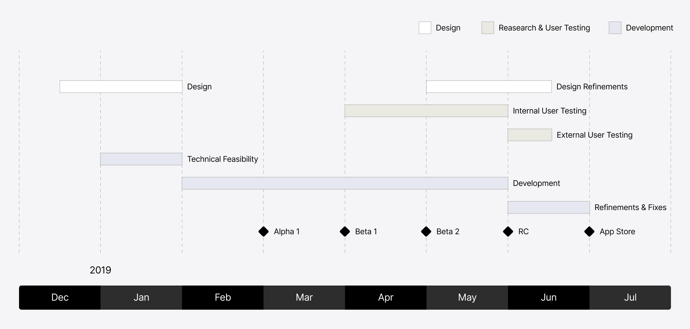
I made a rough plan of the project in order to make sure all the stages are taken into account.
The ideation started with just a few scribbles, pen and paper, nothing fancy. At this stage anything more than low fidelity sketches increases the risk of investing time in artifacts that are later thrown away anyway.
Focusing the design is crucial for saving time later during the process. In order to do this we can use different tools like Personas or Design Principles.
Here are the principles this app was design on.
“Time is money”, so the users’s time is an expensive commodity. Everything should be optimized for speed, especially when the user inputs data.
Nobody reads the manual and best apps don’t have a manual. App features should be self explanatory and extremely easy to understand.
The app should feel solid also from the design standpoint. User will received immediate feedback following any action, visual and where possible haptic.
Compared to the competition, this app aims to be the best in class when it comes to user friendliness.
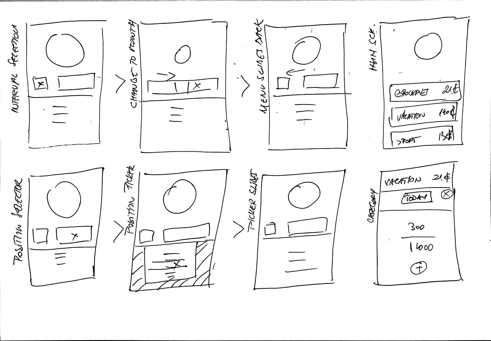
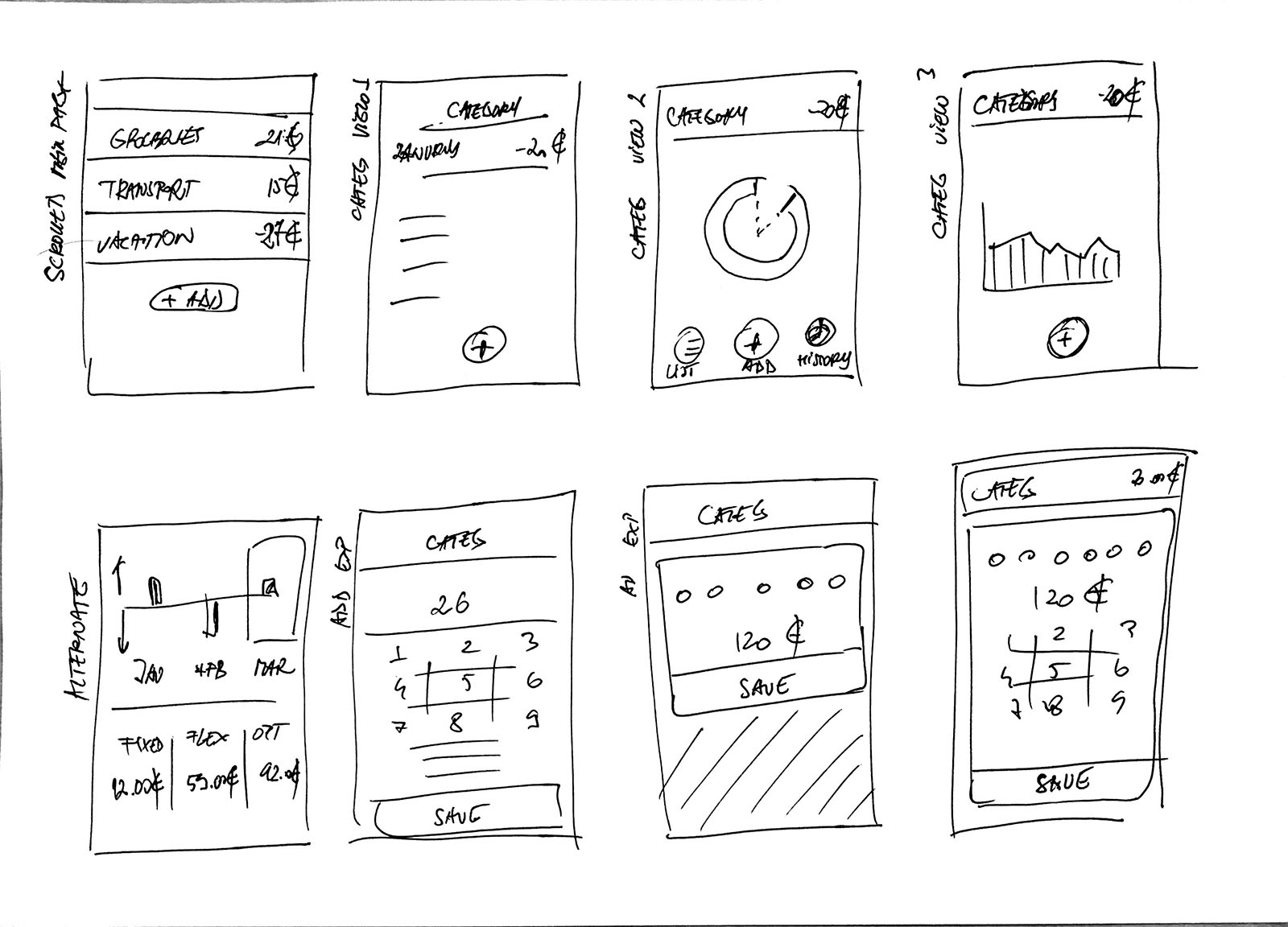
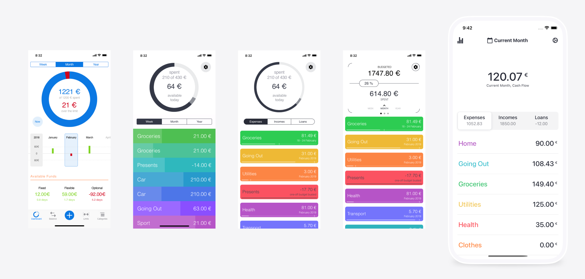
Design is a process and does not happen over night. The initial idea evolves over time and gets refined based on user feedback and research.
Here is a small sample showing the evolution of the main screen of this application as it went through different versions.
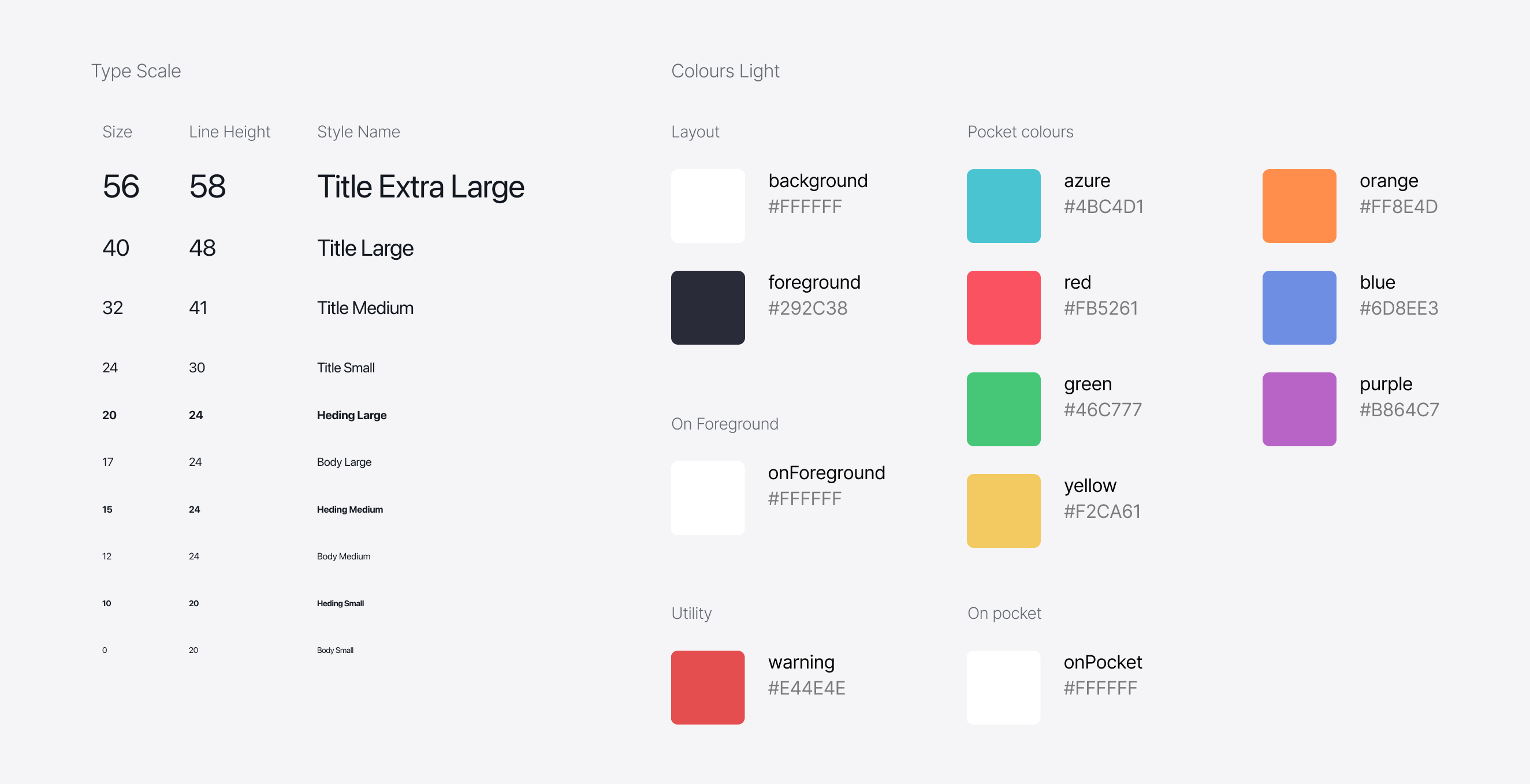
Having a good design system is very important for any mobile app design. It helps align the look of different screens even when they are developed by different teams. In this particular case we do not have multiple teams. Here the design system helps by increasing the efficiency when using multiple instances of the same component – change one and all instances are updated. I used the principles of “Atomic Design”.
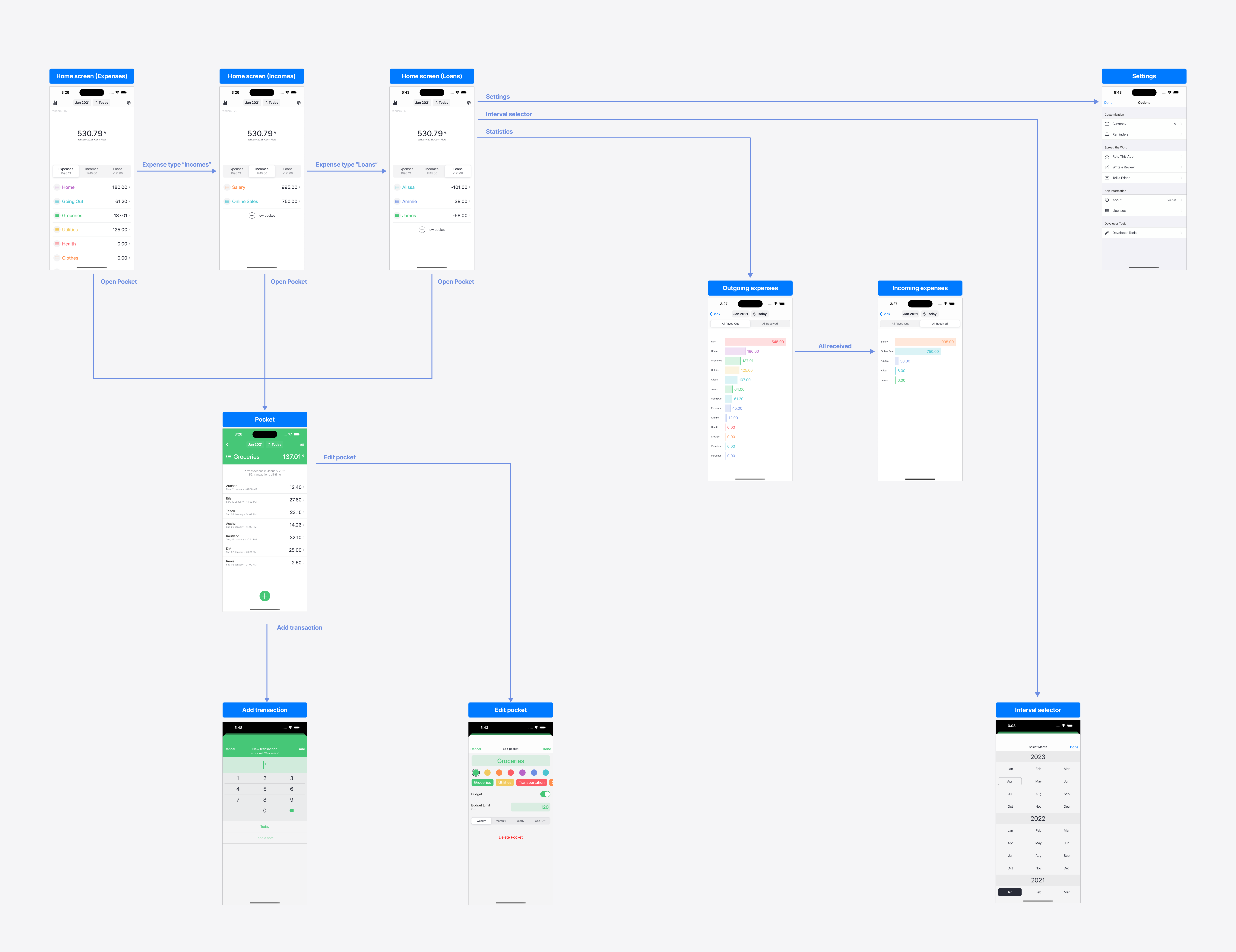
App flows are developed, ideas are compared and measured.
Everything starts to take shape and come together: screens layouts, information architecture, edge cases, empty states.
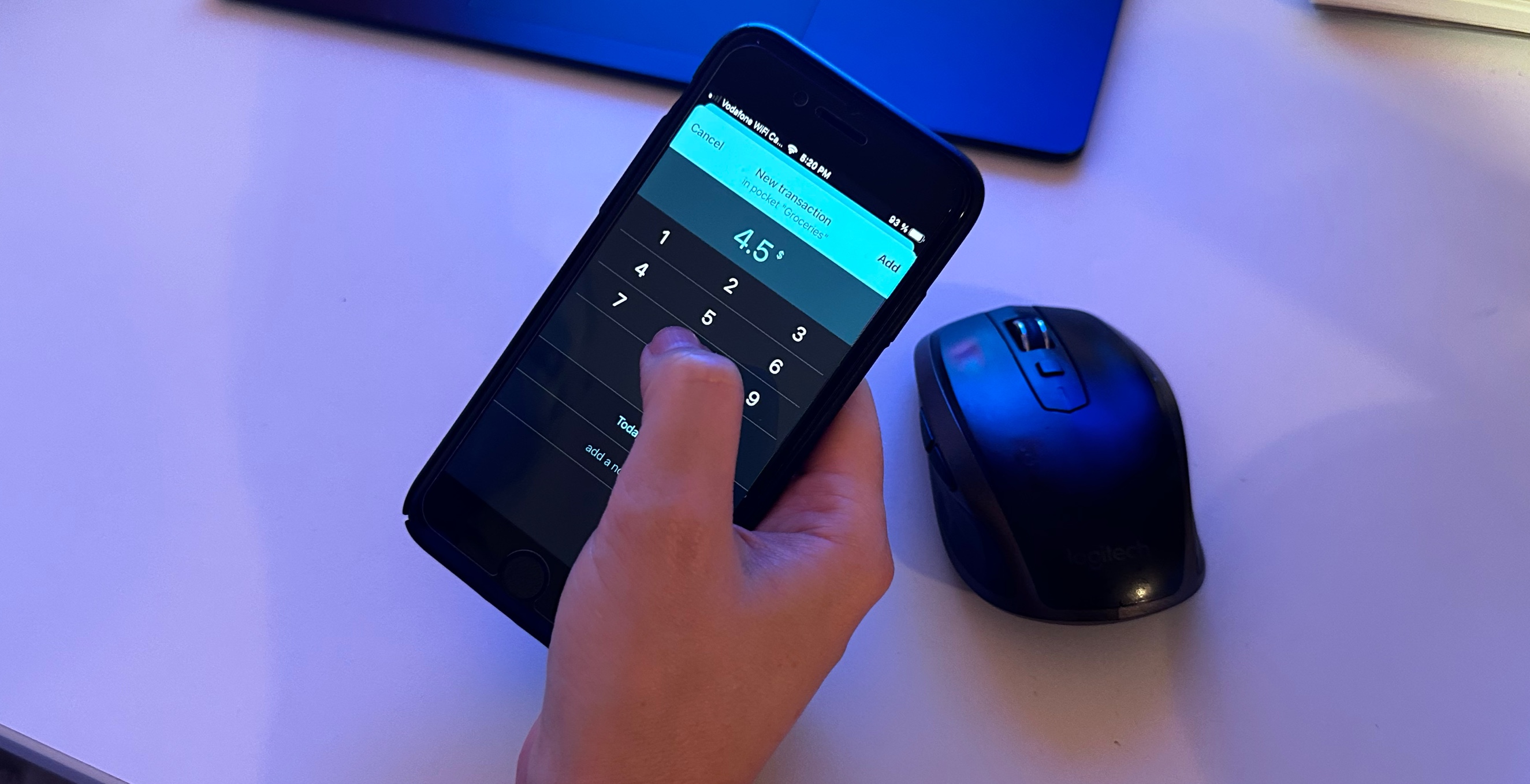
An important part of any design project, user testing was mostly conducted with friends in ad-hoc sessions. The feedback loop is important. Even if this is a side project, testing was done through screen mockups or using the actual app during development.
Always start with the lowest effort possible in order to explore the most versions.The icons design exploration included the creation of several versions of the icon and testing the result in different mockups – iOS home screen, app store screens.
From all the solutions, the final idea had been chosen. This had the highest score.
The section criteria included the following requirements:
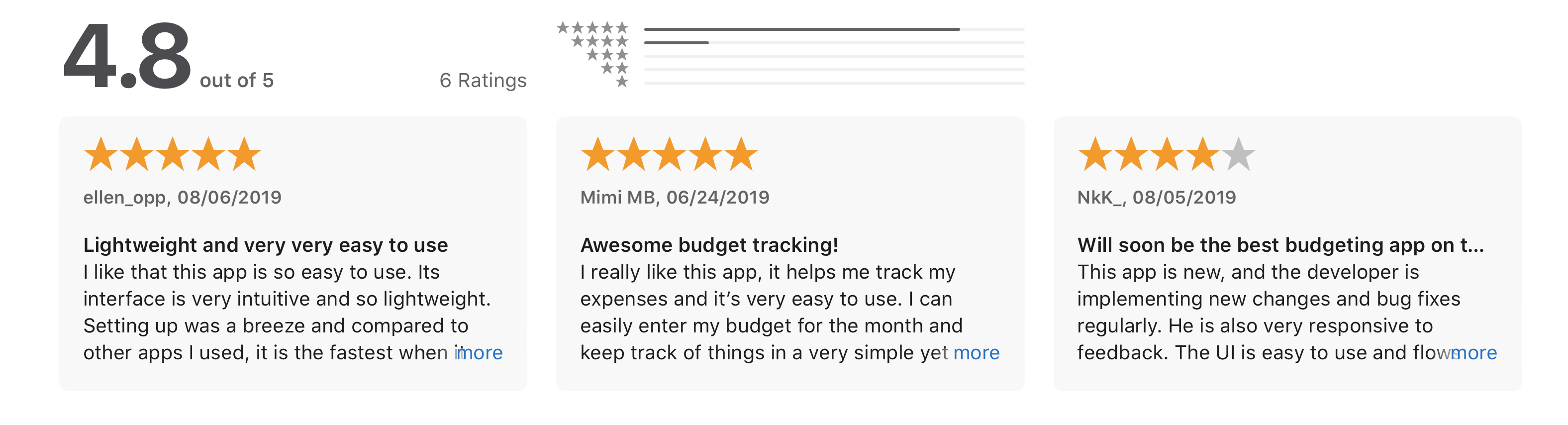
Here are some of the user reviews from the iOS AppStore. These are often a source of feedback and ideas. Dark mode was implemented after receiving one of these reviews.
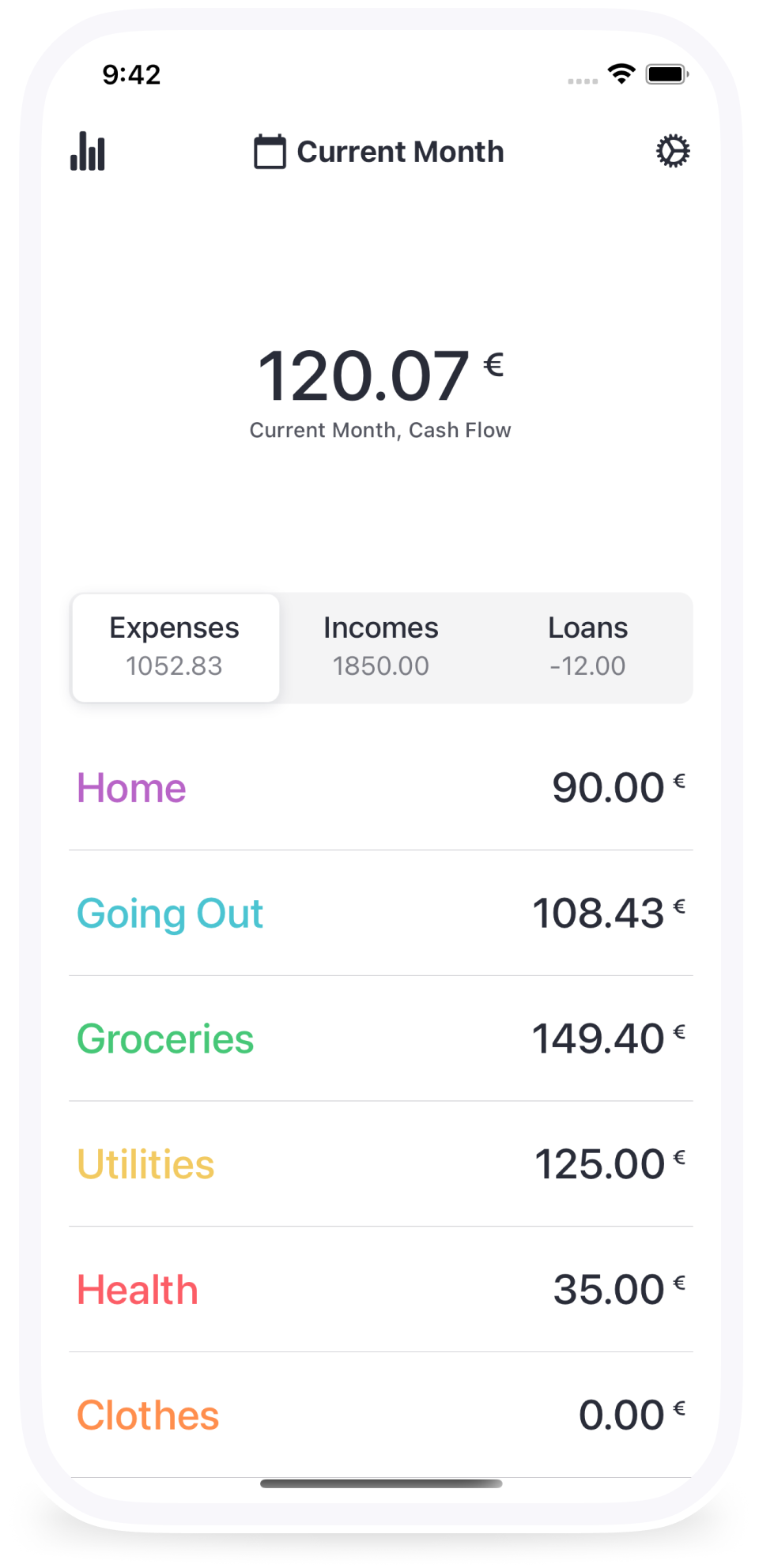
This is how the app looks like after everything is ready and implemented.


